Language switching UI/UX on multilingual sites
∙ 8 min ∙ Deutsch
Backlink: This post is listed as a reference in Designing A Perfect Language Selector UX on Smashing Magazine by Vitaly Friedman. 🤩
When I started this site, it was in English only. But I had, for a while, wanted to expand to a bilingual English and German site. This presents an interesting challenge in internationalization of the site’s source code. Hugo handles this very well. All I needed were the Hugo Multilingual Mode docs and these articles:
- Hugo Multilingual Part 1: Content translation, Régis Philibert
- Hugo Multilingual Part 2: Strings localization, Régis Philibert
First, I abstracted hard-coded strings from my HTML into language resource files. Next, I learned how Hugo handles the logical connection of content files (stored as Markdown) in Multilingual Mode. This is important because you want equivalent pages in multiple languages to be logically linked to each other. The reason for this is language switching (also hreflang links, but I won’t cover those in this post). This logical link is necessary no matter how you’ve implemented versions of your site: subfolders, subdomains or even distinct domains…so pick a framework that supports your implementation. In my case, I use distinct domains, specifically a country code top-level domain (ccTLDs) for German:
- https://www.robertjelenic.com (English)
- https://www.robertjelenic.de (German)

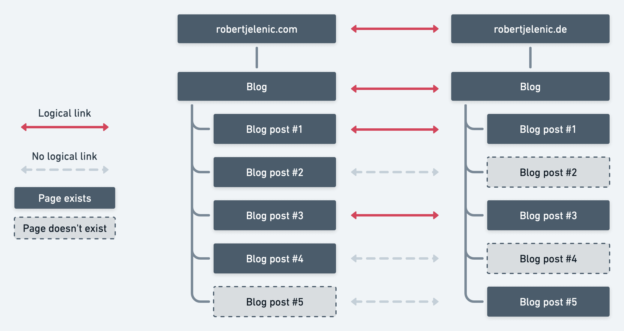
This example illustrates how content can but needn’t exist in all languages. This is a realistic situation and could arise from a number of decisions regarding, for example, a blog:
- You don’t localize all blog posts into all languages, but instead to take a targeted approach.
- You publish blog posts in
target languagesnatively and sometimes decide not to backfill them into yoursource language. - You have a localization process in place and the content in
target languagesisn’t yet ready to publish. But why wait to publish thesource languagecontent in the meantime?
The very last bit I put off was the actual user interface to switch from one language to the other. That’s when I learned how complex and tricky it is to do well. Here’s what I learned and how I implemented it.
The language-switching component
In this article, current language denotes the language version currently presented to the user. And destination language denotes the language to which the user wants to switch. I’ll avoid source language and target language because they have different meanings.
Guiding users to the language-switching interface presents a particular challenge. To be inclusive, you should assume the user can’t read the current language. So presenting the language-switching interface with something like the word “Language” assumes the user can both read Latin script and the word “Language” itself. Those are poor assumptions. Put yourself in that user’s shoes. Imagine you’re a young backpacker trying to book a train ticket from Bangkok to Nonthaburi City after a long flight to Thailand. You navigate to a Thai rail operator’s website and you trying to switch to English. What if the language-switcher is labelled เปลี่ยนภาษา (Thai for “Change language”)? Not particularly helpful if you can’t read Thai.
One critical consideration early on is how many languages you’ll support on the site. This will guide your decision around the nature of the navigation element. If you’re only supporting two or three languages, you may be able to get away with representing the destination language name right in the navbar without any dropdown or modal. If you’re planning on more languages, it’s unlikely you can avoid a dropdown or modal.
At this point, I started researching best practice for icon usage, because I assumed I should use an icon to trigger a dropdown or model. This is actually not trivial. I stumbled across a few useful posts in my research:
- Iconography for translations: best practice for communicating availability of translated content.
- Designing a language switch: Examples and best practices
Italy’s OMC Design Studios even ran a contest for the best language switcher icon and came up with languageicon.org. I read some concerns online about the licensing model of this icon, so please do your own research before using it.
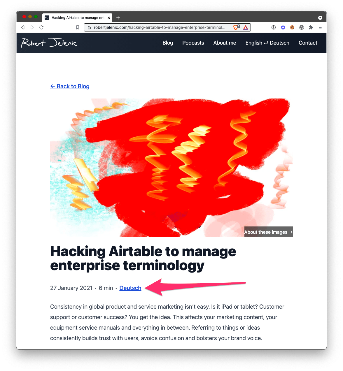
In my site’s case, I support English and German. In the end, sometimes the best solution to a problem is to redefine the situation so the problem doesn’t exist. I wasn’t forced to choose an icon because I pursued a text-based solution. I would highly recommend seeking a text-based solution if you can. The trick is that the user must be able to recognize it’s a language-switching UI component. In my case, I used English ⇄ Deutsch. English-speakers will always recognize the word “English” and German-speakers will always recognize the word “Deutsch”. Localizing that string to be English ⇄ German on the English site or Englisch ⇄ Deutsch on the German site wouldn’t have been a great solution. So in my case, that string is hard-coded on both sites as English ⇄ Deutsch and that navbar element remains consistent regardless of which site you’re on.

Selecting a destination language
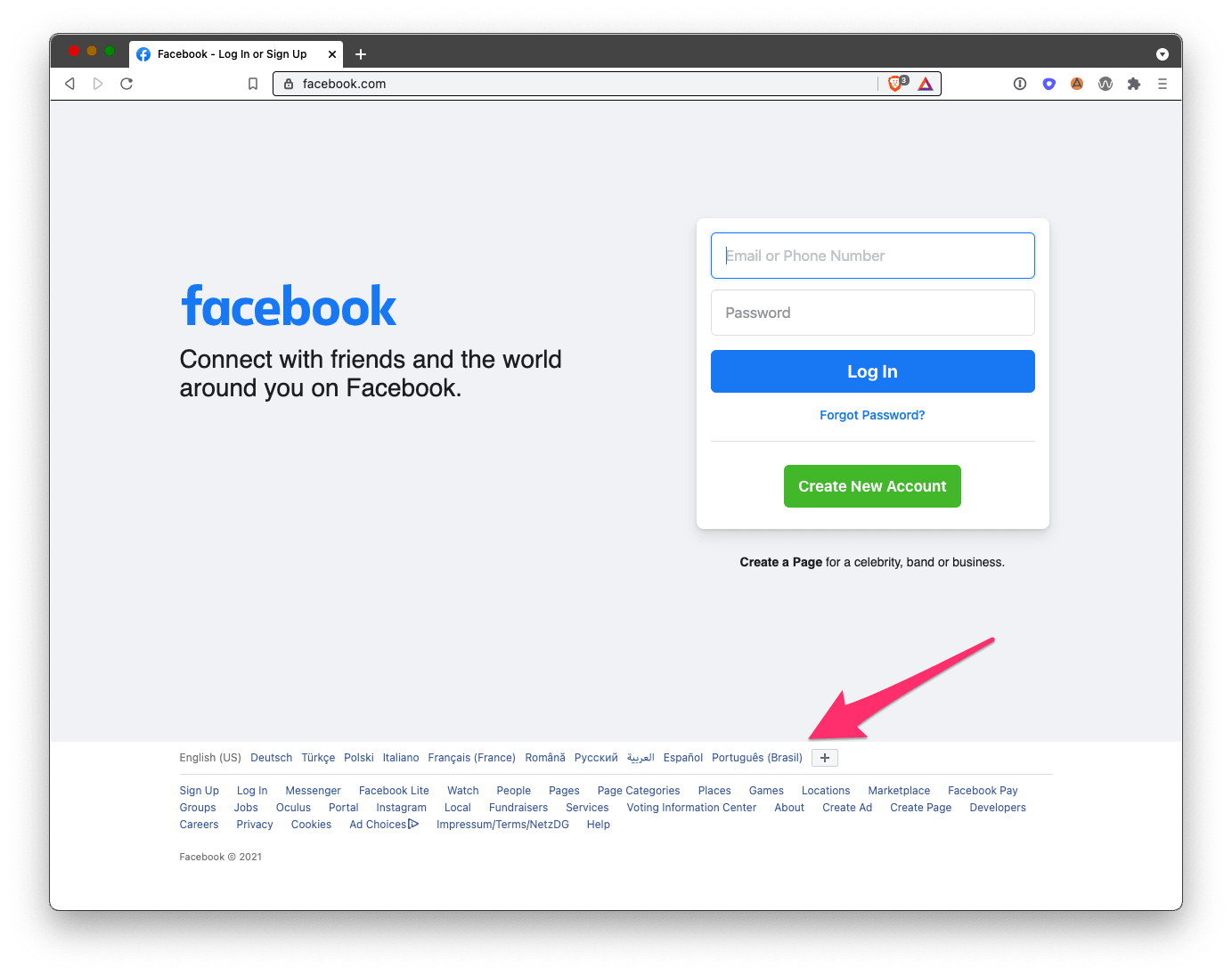
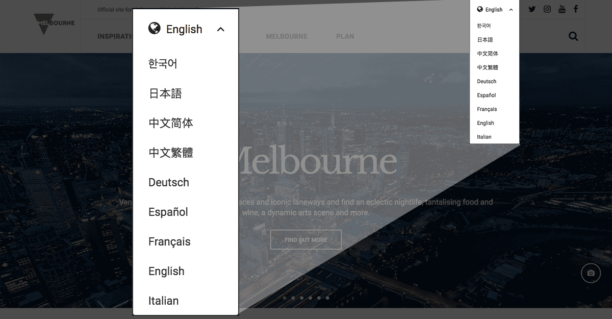
Once you nudge the user to the language-switching component, you need to consider how you’d present the languages. In the example of my site, the concept of language-switcher and language presentation are merged, but this won’t be the case on sites with more languages. Here, I would suggest a simple approach: text.
Flags are not languages is a fun little blog that explores why using flags is fraught with pitfalls. I recommend using text here instead. Always write the text in the destination language. As that blog states:
If you’re linking to pages in German and Chinese, label them as ‘Deutsch’ and ‘中文’ — not ‘German’ and ‘Chinese’.
Two-letter language codes like EN, ES or ZH aren’t great either, because again, they force a user to make the selection based on knowledge of the language code and the ability to read Latin script.

Switching flows
As shown in the first site structure diagram, it’s dangerous to assume that all pages will be available in all languages. It’s very common that feed-based page collections (blog posts, news posts, job posts, etc…) present such challenges. The challenge here is: how do you craft a pleasant user experience for the user who wants to switch to a different destination language if the current page isn’t available in the destination language?
- Scenario 1: The current page in the
current languageexists in thedestination language. We send the user there when she clicks on the target language.![A visual sitemap of when a corresponding page exists]()
- Scenario 2: The current page in the
current languagedoesn’t exist in thedestination language. We then send the user to thedestination language’s homepage when she clicks on thedestination languageand indicate that in the navigation.![A visual sitemap of when a corresponding page doesn't exist]()
Scenario 1 is trivial. Scenario 2 deserves some deeper exploration and I suggest following these best practices:
- Always show all site-wide language options to the user regardless of whether the current page exists in the
destination language. Failing to do so, simply because the current page isn’t available in thedestination language, gives the false impression that the rest of the site is not available in thedestination language. - Inform the user that this page doesn’t exist in the
destination language. A modal is a good option here. - Inform the user that she will be sent to the site homepage in the
destination languageif she continues. This should be the default behavior because there really is no other logical place to send the user. There are other options, but they’re more complex and as I thought about it, the complexity outweighed the added value, diminishing the user experience. - Do all of this in the
destination language(and optionally, also in thecurrent language). It does no good to present English text, describing on onward journey to the Chinese version of your homepage.
I’ll be the first to admit that as of 4 June 2021 I am not following my own recommendation. If a user clicks on English ⇄ Deutsch on a page that doesn’t exist in the destination language, she is simply forwarded to the homepage of the destination language instead of being given the option to stay where she is. I have yet to implement this modal but it’s on my roadmap.
Page-level components
I’ve also implemented an explicit page-level callout to the available language versions of feed-based content on my site. I was inspired by Dan Abramov’s blog, Overreacted.io.

Closing thoughts
This isn’t easy to do well. There are countless examples online of poor implementations. It’s really worth thinking this through, sketching out your options and then working with a good UI/UX designer to nail it. Or, like me, you could try it on your own if a designer isn’t an option. It just takes some thoughtfulness and care. And most of all: empathy for users.
Other considerations related to switching languages are switching countries (with an interdependence on language) and switching currencies, especially in ecommerce applications. Both of those topics are beyond the scope of this article but present interesting challenges as well.


